Assignment 2 | Icon iteration + HTML
Not much to say here.
I did some of my Iterations on my icons in the last post.
![]()
Design decisions in the development of icons
- Settings: pretty much the original idea, I wanted to stray away from the normal cog just because I think it's overdone but the nut also feels like it fits the aesthetic of lower geometry shapes and is better suited to flat design.
- Activity log: Funnily this was my favourite in the beginning and what I based the other designs on now it has. become a little ambiguous. It is hard to tell it's a hologram and a hologram itself barely relates to the idea of a history or log. I think this icon will have to rely on a good flip icon and sound effects effect to support it.
- Move: I started with the horizontal arrow but I thought it might look too similar to the trade icons. Making it vertical instantly makes it feel more like travel
- Attack: As mentioned earlier the attack icons were inspired by the yu-gi-ph card mirror force. I think simplifying the form made it more flat👏
- Build: I liked how the arrow can be seen as a house in the context of "build" but to differentiate this icon from "move" it will need a recognisable sound.
- Unlock: The brain planet seems fun but I can't really visualise how I could make the whole planet a brain...🤔 for now the lock is best. I was trying to explore something to do with paths and upgrading with the USB-looking shape but I think that's too symbolic. the lock is obvious and easy to generate a flip icon.
- Sell: I like the idea that it's the inverse of the build icon with an arrow downwards creating unity and supporting the logic.
- Trade: I love the gradient one but the two planets might be the right choice to go with🫠
- End turn: loved the idea of a moon or a crescent animation to symbolise the end of a turn but without the animation, the dotted arrow best says action ending. I was toying with the idea of the arrow ticking away the longer hovered over the icon but potentially too complex😔
I may need to consider how these icons are going to line up next to each other, e.g. if the planet is the centre will there be a bounding box?
HTML layout downloaded the site is live the fun starts here🤠
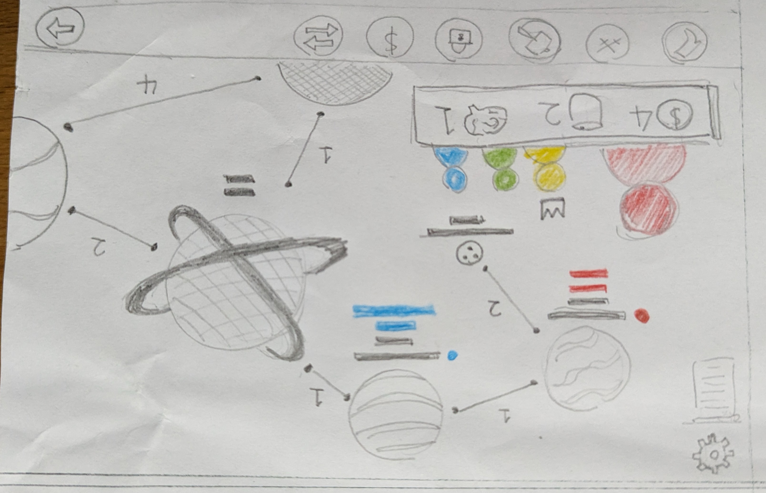
In terms of CSS layout, I want to make my own, like in the initial drawings:
 two rows separated with game visuals dividing the settings and activity log from the action buttons. I don't really mind if it is collapsable/mobile compliant because the game should be played at full screen at all times.
