Assignment 2 | Finalising Icons and implementing sound
Finnishing up icons
After picking out some of the good developed ideas in Illustrator I worked on making the flip side icons. when I was doing this I wanted to focus on making the
- line thickness
- shadow placement
- colours
- rounded corners
- and centred placement of planets consistent.
![]()

I made these boxes to make sure each planet was in line and the same size when exporting🧐
Making the alternative design for most of the icons was pretty simple, just reversing or moving elements around.
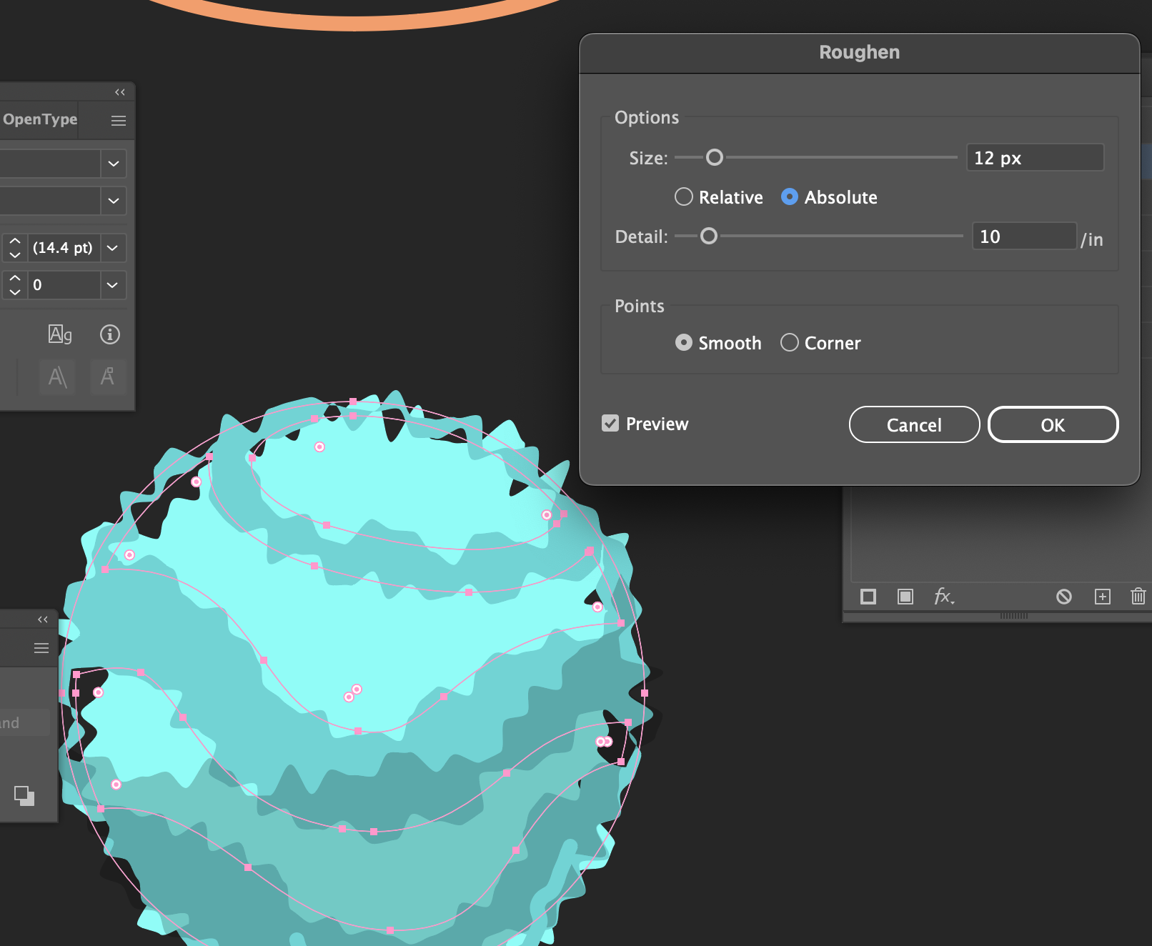
For the activity log icon just applied a "roughen" effect to the expanded shapes and messed around with the parameters. I found that low detail and smooth points were really effective in recreating that static effect.


Something I was tossing up was the balance between aesthetics and consistency. I wasn't sure If I should outline all the arrows but it turns out consistency often does equate to better-looking design(well in my case at least).
To export the Icons I lined them all up in a small artboard then toggled the transparency on for each design and exported them as PNGs.
Sound
I recorded most of the sounds at home which was a lot of fun. Settings was a spinning bike cog, Activity Log was my radio, Move was a cardboard box, Build was two teaspoons hitting, Unlock was a door latch, Trade was a stack of coins, and End turn was a rubber band.
I spent quite a while thinking up, recording and editing sounds for attack and sell but I couldn't quite get what I wanted, I resorted to looking on the Free Sounds.org website and found exactly what I needed.
Attack sound: ChargeAttack.mp3 by grizzlymittz https://freesound.org/s/535239/ License: Creative Commons 0
Sell sound: cha ching.wav by creek23 https://freesound.org/s/75235/ License: Attribution NonCommercial 4.0
Once I had collected all the sounds I liked I imported them into Adobe Audition and made some subtle changes like trimming down the size, fading in and out and normalising. Importing them to the site was super easy with the template.
CSS
I've not used any HTML or CSS in the past but I did know that Adobe Dreamweaver has something to do with it so I started by opening up a default website in Dreamweaver and ripping as much of the preset stuff as I could.
Like the Chinese room thought experiment I feel like I was just relaying the information. If I had more time I may have found a more elegant solution like following some tutorials but I managed to create a very basic layout by labelling the icons as variables to give them alignment* and padding. I also managed to add an image emelent to the middle so I could make a mock-up of the game visuals.
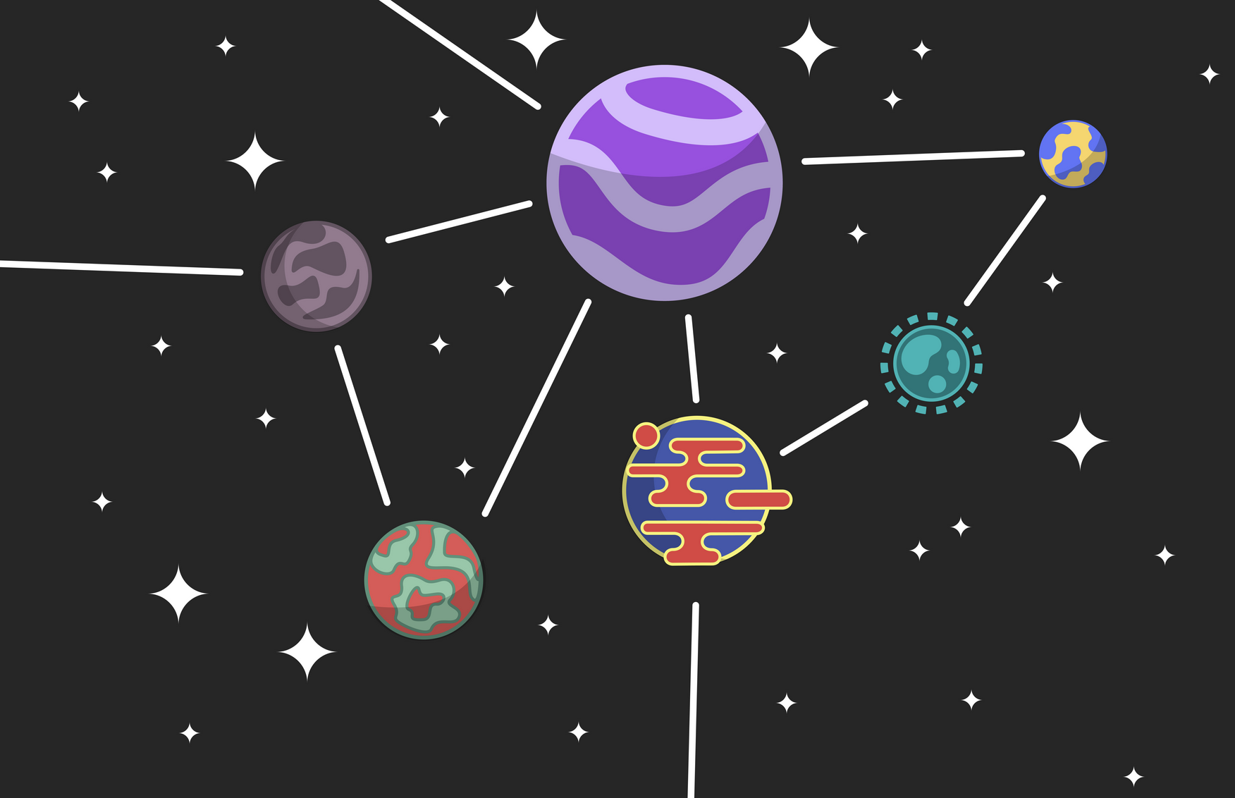
Making the game visuals was a tedious process, initially, I made a bunch of planets and connections with a starry background but I couldn't get the scale of the image to match the web page perfectly and it also wouldn't scale dynamically. Next, I tried making the planets a PNG and the stars the background image but something in the CSS placed the image above the buttons meaning they were no longer clickable. Finally, I just ended up making the background a tiled image of the stars and excluding the planets.


