Finishing touches
Extenstion 🙏
Building the aesthetics
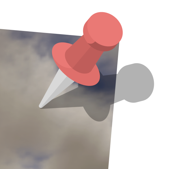
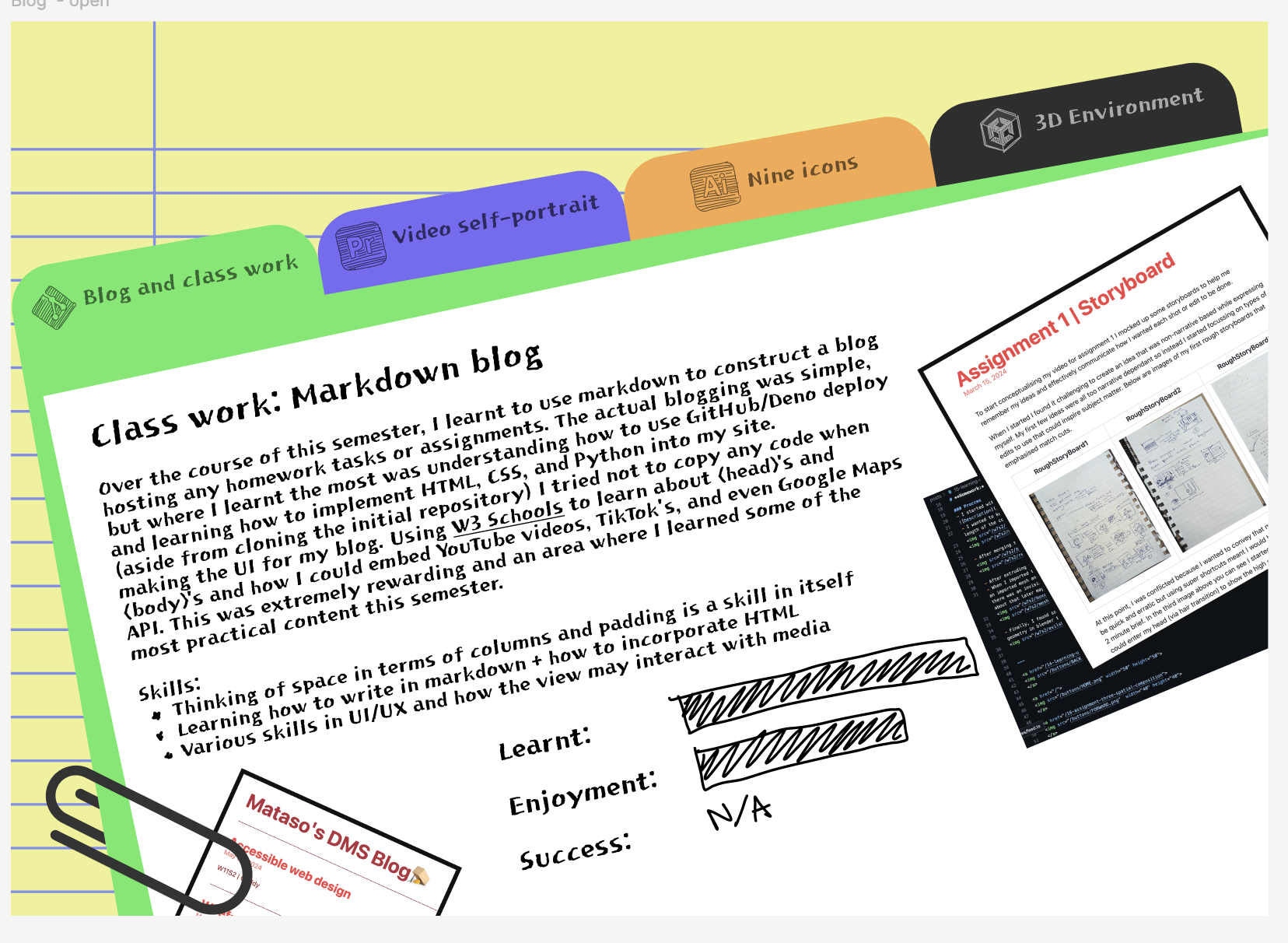
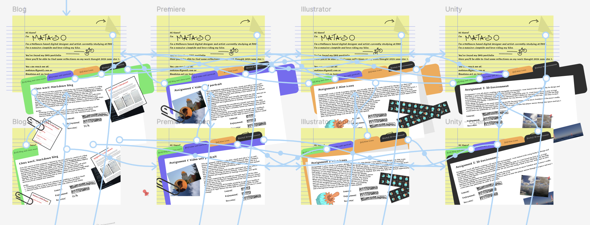
I started with asthetics... I know the whole point was to consider wire frame first but now that I'm onto by final I had played enough with wire frames in the privious weeks to know what I want and how to make it. I started with thinging more about what I wanted the site to say. As discussed in the previous post I wasned the childish playfulness. I am somwhat who loves drawing so I though it could be fun to intergrate some hand drawn elements(I initially wanted to handwrite the whole thing but my writing is too messy for that:/) This gave me the idea of theming the portfolio around real physical folios/folders. I quickly mocked up a look using yellow paper and lines (I am dyslexic and find that yellow paper with lines helps me read. little easter egg). Next I made the folders, Flat design best fits the aesthetic, (1) I'm 'modern' and like current design. (2) its coloutful (3) its easy! (4) I got to show of some of the flat design skills from assignment 2(show off is an exaduration, I dont think anyone will notice the detail on the pins😔...)
^^ all made in Figma using circles, boxes, and boolians
I wanted to keep some of the information visual. I devised a graph system that shows at a glance whether I liked, learnt, or did well in each assignment. I really wanted to animate teh bar filling on hover but Figma sucks!
I played around with some drawing... first with icons on the tabs but it felt too crowded.
Function
All the writing I smashed out in a few hours. Then got into the nitty-gritty of the page layout. where each image sat, each pin and stuff like the typography, font size and leading and tracking.
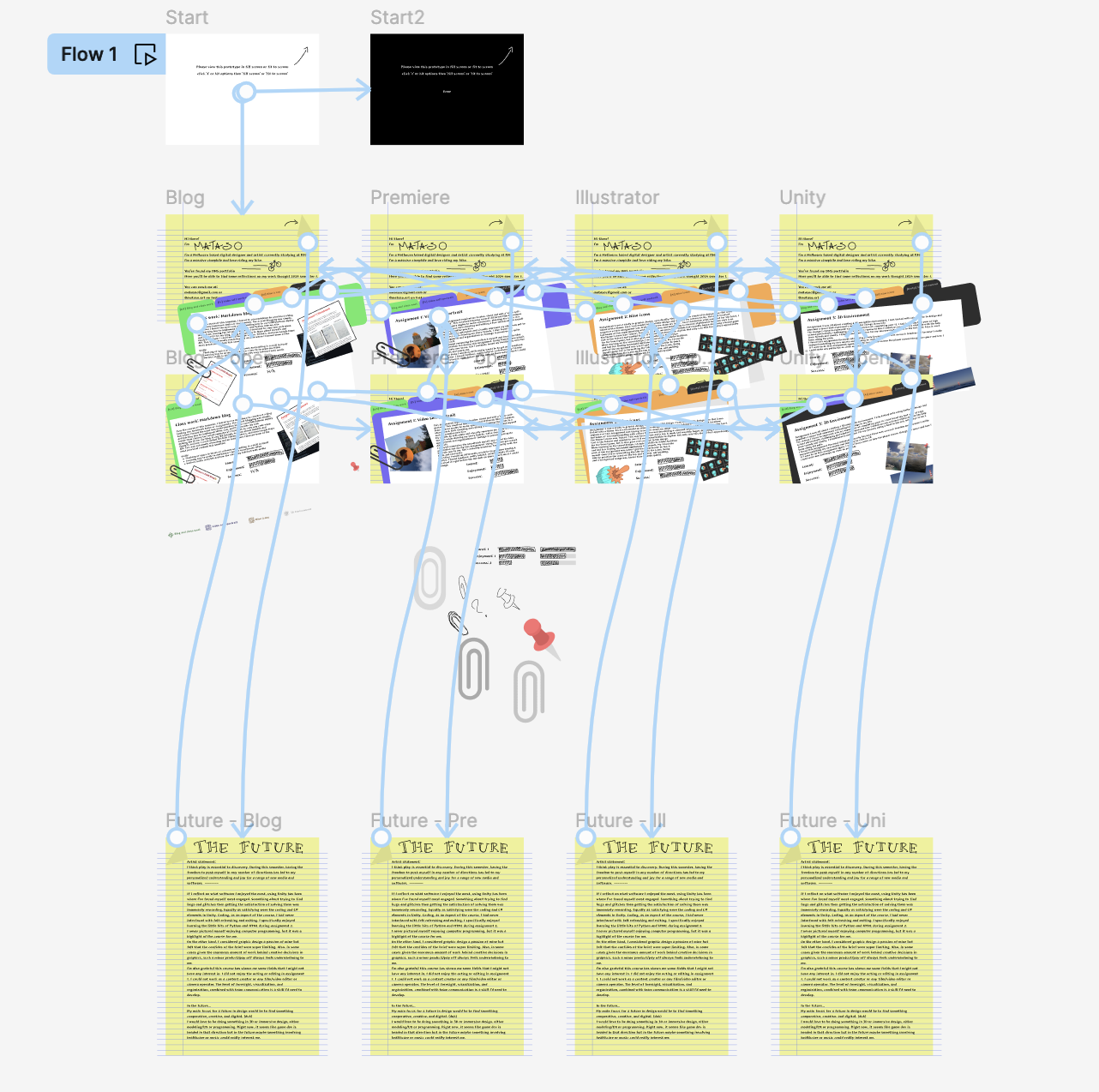
Once I was happy with the UI of each tab I started on the movement. I use Figma's smart move for most of the animations. I wanted the hover to switch the tab so it was effortless but need an executable to open each folder. I tried a drag but it wasn't as intuitive because you needed to drag the whole distance.
Pretty Messy
with the "Future" page I got feedback from a friend that the page should remember what tab you opened last and set you back to that. 🫡
Made some assets in Figma ^^ the pins and clips.
Finally, I added some finishing touches with the pen took to write my own name and some arrows and drawings.
one of the hardest parts of the whole process was the naming conventions of each asset and items needing to be in the exact same position.
Final final touch was to add a 'use full screen' intro so that it looks just right👌
Mobile
Then onto the mobile version. super easy considering I had all the assets and text🤷♂️ I pasted them all in and rigged up some movement (I used swipes for accessibility on mobile)🙂. I was happy to be able to reuse the icons I scraped in the original for mobile. Another accessibility consideration is that mobile users will have less screen room meaning icons are better than text in most cases. I didn't need the full-screen disclaimer.
In the end I am really happy with how the site looks. I think I may have written too much of the wrong things and too little of the important stuff but in terms of the use of Figma I was happy with the product I produced. I liked the anti design and not conformaing to the grid and I enjoyed refectling on what I have done and what I will do in the future. 😊
All done
Check this out:
and this:
https://www.figma.com/proto/eHNaxjAvzJPIeiaDY7bVt6/DMS_Assignment4_Mobile?t=k94Ut9mB4I7UGqCg-1
Actually that's pretty shit, Figma is useless^
