Accessible web design
today we looked at accessibility and how websites (and the virtual world) should be made accessible to everyone. We looked quite a bit into colour, in terms of contrasting colours and colour blindness.
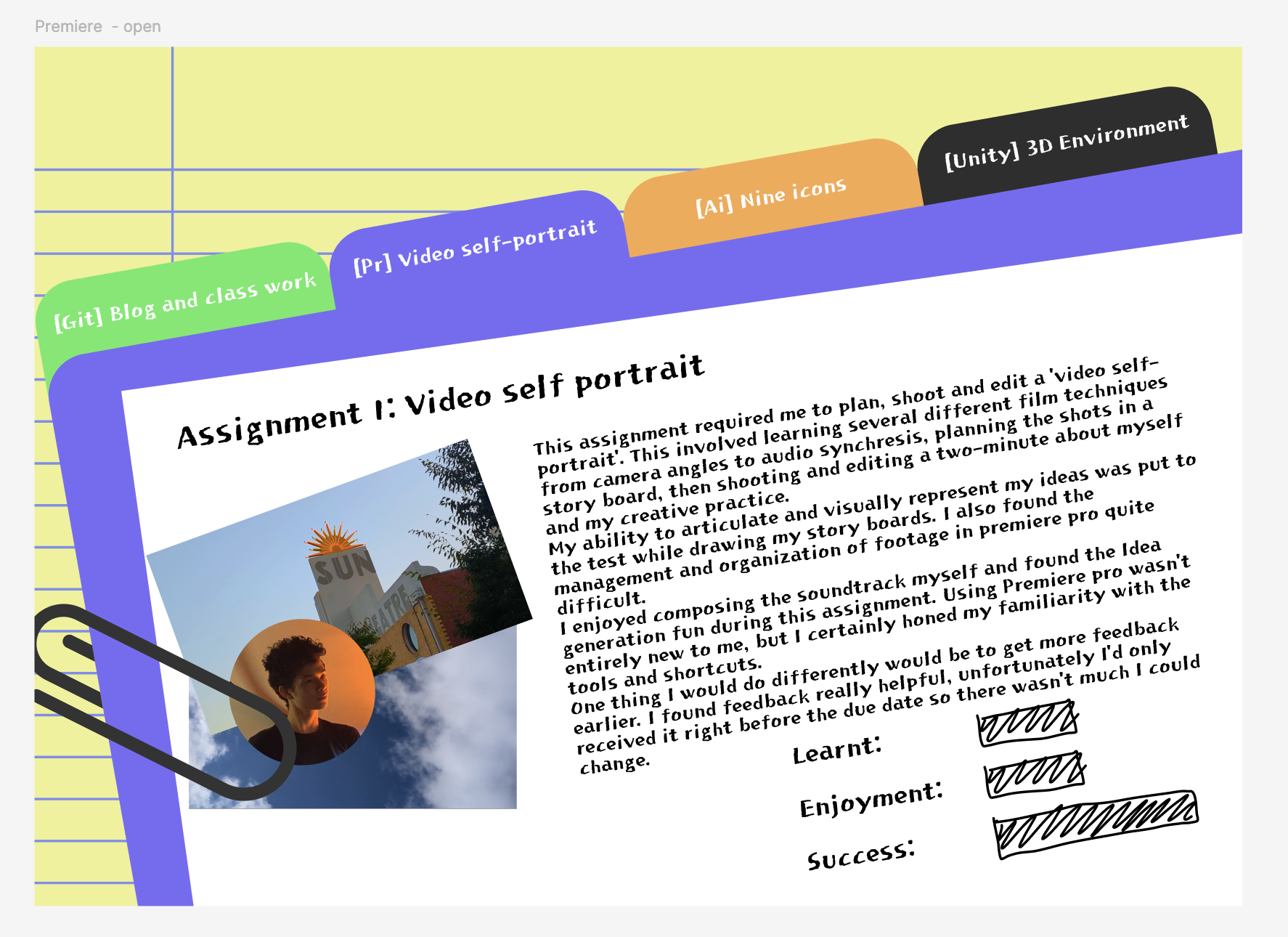
Reflection on figma iterations so far: I've been pretty behind that curve for a while but I am happy with the ideas I've come up with so far. I think the playability and ingenuity of my page is something important to me. I think the writing is secondary, colours and movment are primary!! I think I want my page to break a few rules. maybe not have all things centored or throw away the grid rule. I know anti-design is really 'cool' at the moment (or I gues always has been). Focussing on a final look (with accessability. in mind) I want the site to be colourfull, playful, and almost childish.
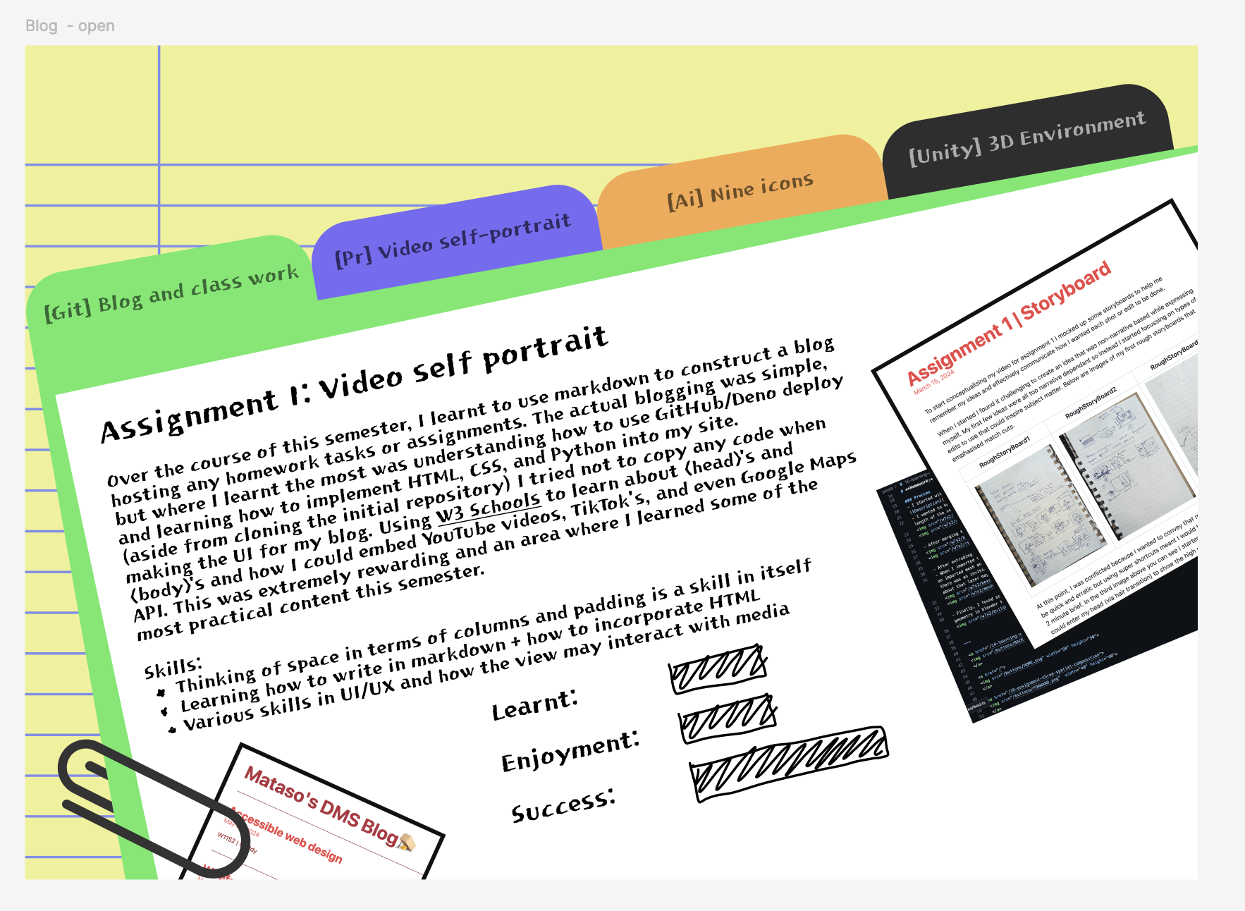
future mataso from 6/20: One accessibility change I had in mind was using similar coloured banners. It seems counter intuitive to use the same colour as the banner for the text but I found that becuase I had such bright colours the dullers the tutles were the more you could see them.

^barely visible on green

^Much easier to see
